User Interface (tiny) Annoyances
Some of my annoyances when using digital interfaces
User interface design refinements is constant and unending. With many moving parts, even the best product release will contain unexpected annoyances that can taint user experience. Below are some of the annoyances I encountered recently when using web and app interfaces. These are undoubtedly tiny annoyances, but the accumulation of these tiny ones would adversely affect your users’ experience.
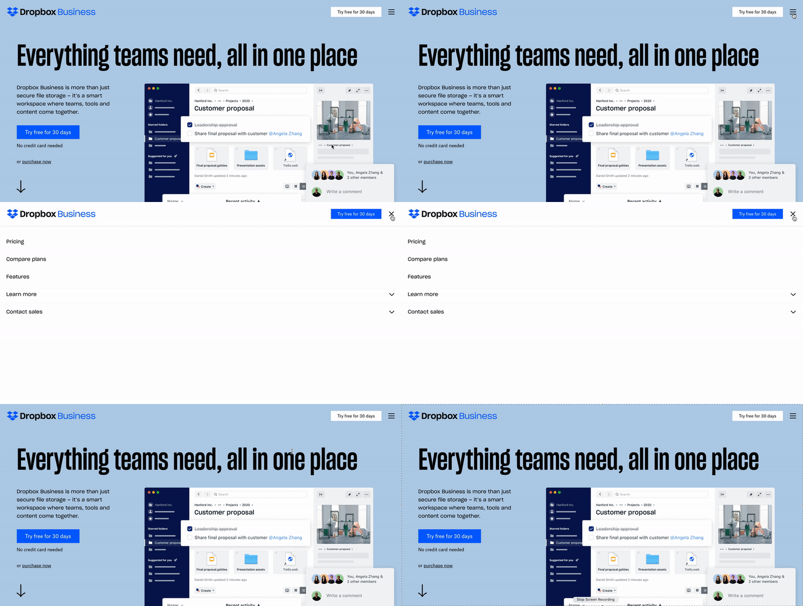
Dropbox When I click on the three line menu icon on top right of its website, I’ll be looking on the right side of my screen. But when the menu opens up with its left-aligned text, I have to shift my gaze to the left side of the screen. The gaze-shift can be a tad bit more annoying on a bigger computer screen. Relocate the 3 line icon to the left, as a quick fix. Maybe?

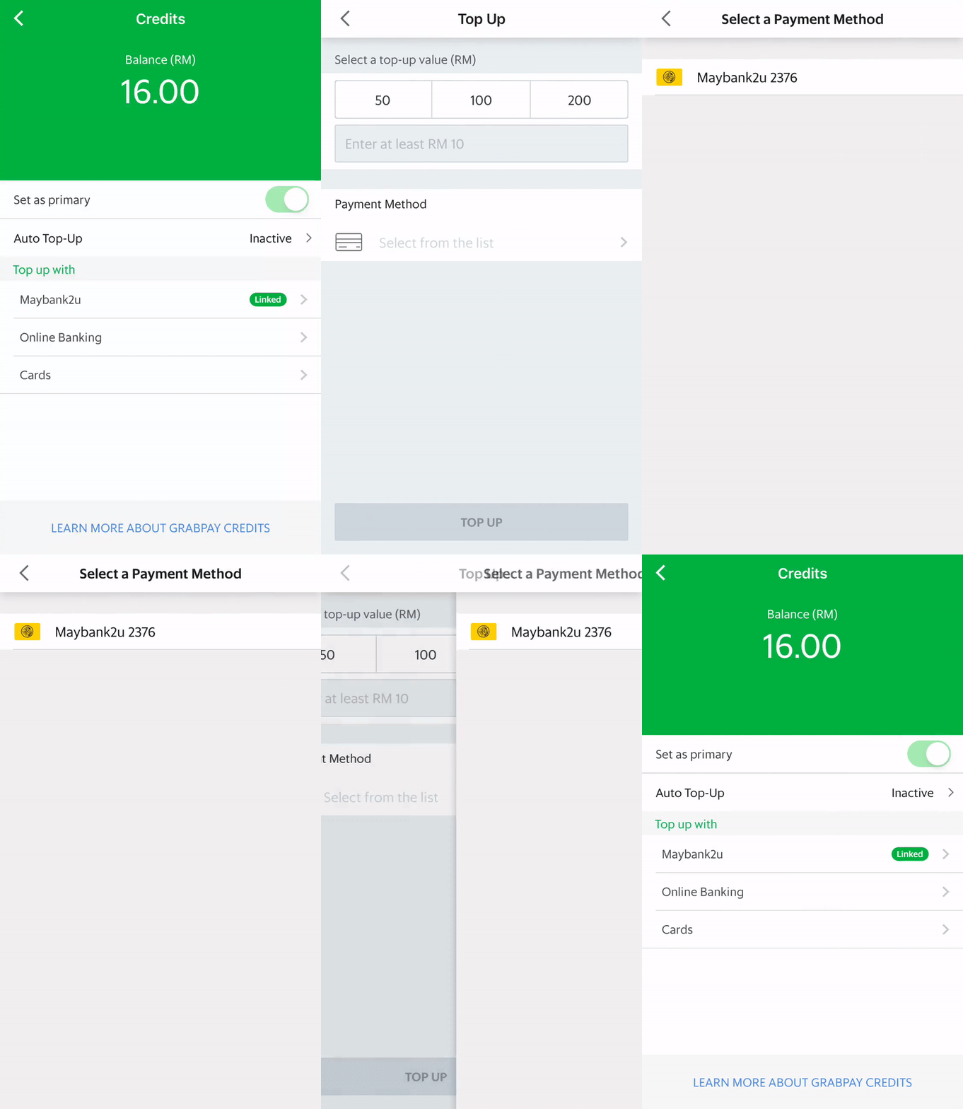
Grab This Asian tech juggernaut recently released a feature that allow me to link my Grab e-wallet with my bank account. I can now skip the hassle of logging into my account whenever I want to top-up. After linking, the top-up option selection list contains the linked account option (together with existing online banking and cards). However, when I choose to top up with the linked account, I will land on the Top Up screen. On this screen, I have to select top-up amount AND select my payment method. Didn’t I just choose my linked account as the payment method in the previous screen? Why the additional user intervention? Redundancy and yeah, a tiny annoyance.

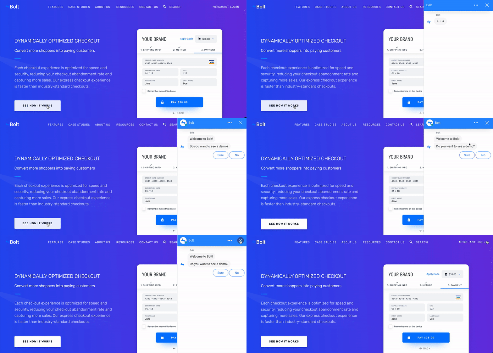
Bolt When I decided to click on “See How It Works” button, I was expecting to see a page containing more details about the product. A chat screen appeared, instead. I have to answer questions in the chat and put up with automated canned responses (that try hard to mimic human responses). Maybe a better button label would be something like “Chat with us” or “Chat with our bots”. Set the right expectation for your customers with appropriate description. Tiny tweaks can go a long way.

I bet there are many more tiny annoyances out there. As a product designer, being sensitive to these tiny ones can go a long way in reinforcing a habit of attention to details. Paul Jobs once advised his son, Steve: “You’ve got to make the back of the fence, that nobody will see, just as good looking as the front of the fence. Even though nobody will see it, you will know, and that will show that you’re dedicated to making something perfect.” To make your design fantastic, be holistic.
